

Safety Data Visualisations
Useful way to visualise and spot a safety signal?
ESource systems not only help clinical staff capture information reliably and efficiently, they also make it accessible immediately to all authorised and interested parties.
They should also be able to present it in a way such that it is easy to review and to spot trends. We should be able to start with a 10,000 ft / 3000 m view, and then drill down if we see something interesting. We need study level visualisations (totals, summaries), the same for cohorts, and ideally for individual participants.
How do we help the clinical teams, the investigators and the monitors see the wood amongst the trees, separate the wheat from the chaff and distinguish the signal from the noise?
In early phase trials (all trials!?) we often use commonly available clinical safety parameters to monitor the continued health and well being of the participants.
In the days of paper source documents, the investigator could quickly flick though ECG printouts, bundles of lab reports, tabulations of vital signs observations and meticulously recorded adverse event and concomitant medication data to get an impression of the participant’s state of health. Are there any changes from baseline, any trends? Any patterns across all participants, or just the one isolated participant that picked up a bug on the day they checked-in?
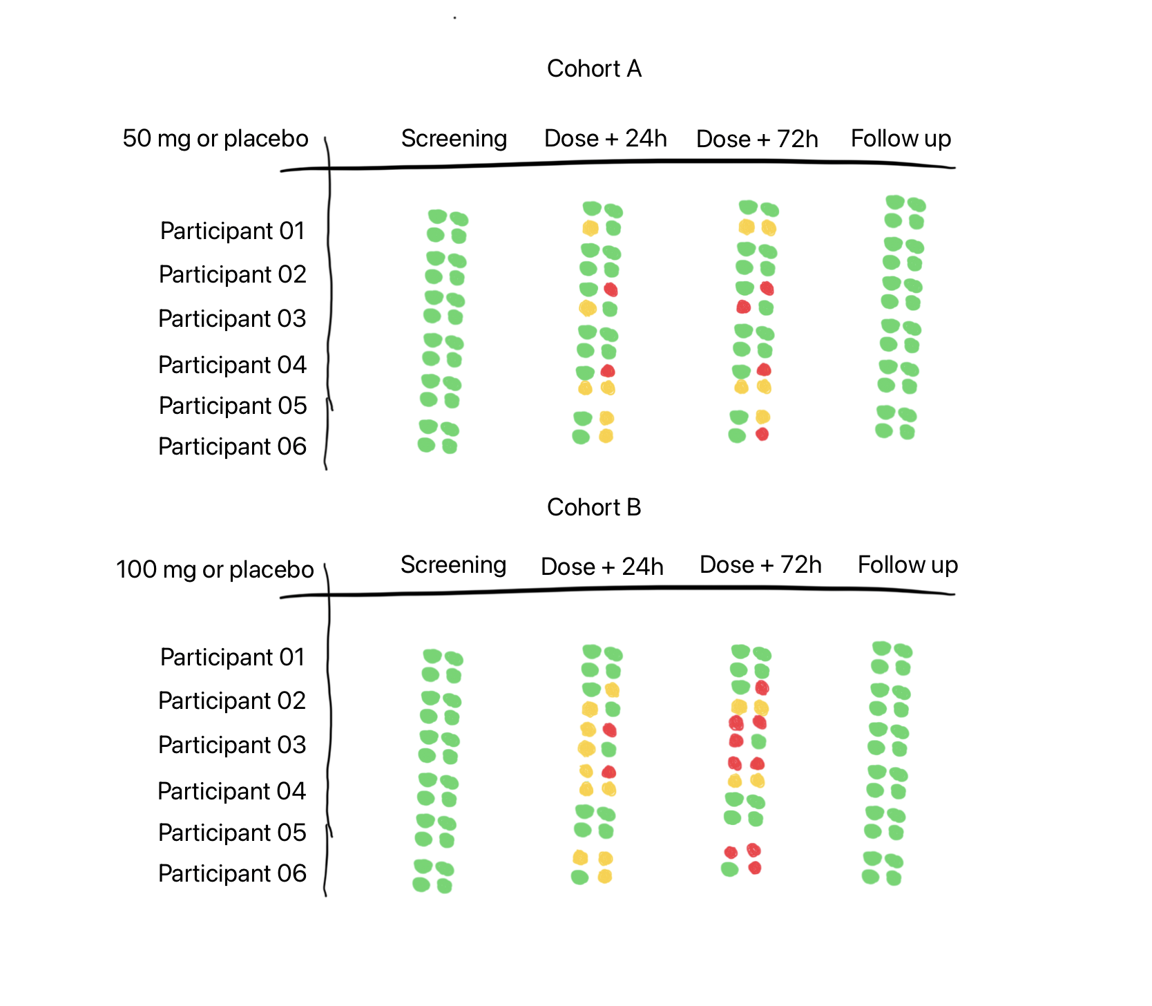
So what am I showing in the tabulation above?
Each cluster of four dots represents a safety parameter. They could be:
Adverse Events
Laboratory Values
ECGs
Vital Signs

Four safety parameters selected for a particular trial, from a range of options.
We could just as easily swap out any of these four, and substitute it for ‘lung function’, or ‘concomitant medications’, as the protocol dictates and/or as the investigator prefers.
No need to limit it to a 2 x 2 grid of course - we could try a 3 x 3 grid, packing in more information - but we might start to lose the signal amongst the noise.
So what logic might we have in place to set the colours of the dots? To make them either Red, Amber (yellow for some outside the UK) or Green.
Note: Red / Amber / Green is nice, because we then get ‘RAG’ charts, as used by our Project Management colleagues.
For Adverse Events (AEs), perhaps we could set the dot to green if there are no AEs, but change it to amber if there are any Mild or Moderate AEs and to red if there are any Severe AEs. As we have only three colour states it is a bit of a crude tool, as we have combined two levels of severity (mild and moderate) into one colour state. We are also not getting any indication of the number of AEs. Ten severe AEs will show as red, as will one severe AE. We’d need another dimension, maybe brightness or size, to indicate magnitude or frequency - something like a bubble chart. Brightness might be hard to spot and size would mess up the neatness of the grid.
What about for safety laboratory tests?
For green - all results across all panels are within normal range for that visit / time point. Amber could be set when some results are outside their respective normal ranges. We need to find the tipping point which would set the dot to red. Again this is a crude measure, but can we make it useful enough to highlight an unwanted trend and encourage the doctor to drill down deeper. It’s only useful if the number of useful signals is truly higher than the number of false positive signals.
The same will probably apply for any given physiological parameter - finding transition points between normal for this person, to something not quite right, and finally, this needs close attention!
In my fictitious example at the top of the page we are happy to see that all participants start the trial with a clean bill of health and finish it the same way - green lights across the board.
In the 50 mg / placebo cohort we might feel that participants 2 and 4 have been given placebo - the dot cluster says green for all parameters all visits / time points across the trial. But we know in practice that there is regularly background placebo noise and it might even be unusual to see a completely clean signal. In the 100 mg / placebo cohort, we might suspect participants 1 and 5 are on placebo.
As we go down the page we see that Cohort 2 has a higher dose and I have accordingly added more amber and red dots intending to show a difference compared to the lower dose in Cohort 1. In real life I am sure it would not be so simple.
If this visualisation were to be properly tuned and able to detect a real signal, then maybe it should be available only to independent safety reviewers, and not be visible to blinded investigators.
My imaginary tabulation is envisaged as being interactive, if the user clicks on the dot cluster, you are taken immediately to the raw observations across the timeline and can perhaps then see a plot of the data. Real treatment and management decisions would need to be made on the precise values and measurements, and not on the RAG dot clusters.
So, what do you think? Might something like this work in the real world?
Related
I wrote about automating the creation of safety lab summaries for dose escalation meetings in an earlier article.
That article was mostly inspired by Frank Harrell’s 2007 paper on automating the process for a ‘Closed Meeting Data Monitoring Committee Report’ (link), even though his focus was on larger, longer trials in patients, and with a comparator product, rather than a placebo controlled trial in healthy volunteers.

Figure 5: Kaplan-Meier estimates of cumulative probabilities of adverse events by treatment over time. Dotted vertical bars indicate half-widths of approximate 0.95 confidence intervals for differences in probabilities. When the distance between two proportions exceeds the length of the bar, differences are significant at approximately the 0.05 level. A:—— ; B:——.
From: Example Closed Meeting Data Monitoring Committee Report, Harrell F, 2007 (link).
‼️ Notes
My thinking here is purely exploratory and has not been tested with real data, and it certainly has not been ‘clinically validated’.
I am not an engineer, so I have no idea what sort of computational load would be needed to create such visualisations in a production eSource system. If possible this would be the best place for it, the place where investigators are working every day.
Should such a dashboard ever be realised, perhaps some thought should be given to accessibility, especially for users with red-green colour vision deficiency. Perhaps a user enabled toggle to optimise the contrast etc. for these users.
To keep the illustration simple, I kept the pre-dose time point off the chart, I would expect these to reflect the screening dot cluster - all green. Not all protocols will require a distinct visit for Follow Up, this could be included at the end of the last in-patient visit.
Again to keep it simple, I have shown only six subjects per cohort in this Single-Ascending-Dose-like (SAD) study design. Once-upon-a-time, SAD cohorts would have typically included eight participants, and in recent times this would be been split into a sentinel cohort of two participants with the remainder being dosed 24 - 48 hours later.
Lastly, my fictional SAD study only shows two cohorts, when there are likely to be 3-4 more.